Tuesday, June 23, 2009

Inks!

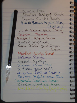
We recently purchased a few Fountain Pen Ink Samples from the Pear Tree Pen Company.  We touched on how much we like the idea of the ink samples (and the practicality of the glass pen in this regard) in this post.  But, boy, the ability to survey all kinds of colors and brands of inks in the matter of minutes is invaluable.  Testing inks in different brands of fountain pens introduces too many variables to give you a true comparison of the inks, including both color and flow character of the inks.  The glass pen gives you the ability to compare inks side-by-side with the same set of variables for each.  

Here's a quick rundown of the samples we recieved. (Of course, I think we have to include a disclaimer here; the colors that you see in the picture may or may not be at all like they are actually.  As much as we try to portray the true colors of the inks, there's too many other variables such as lighting, photo quality loss from digital camera transfer, and monitor settings).


Diamine Grey - reviewed below

Noodler's Bulletproof Black - A classic black.  Although it takes a little longer to dry, so there may be issues with smearing.

Diamine Quartz Black - Initially, we were hoping for  it to be more on the grayer side than the blacker side.  But, overall, it's a nice saturated black.

Private Reserve Midnight Blue (Fast dry) - reviewed below

Private Reserve Black Cherry - Purple and brown hues combined at just the right ratio to produce this really pretty ink.  

Diamine Maroon - No surprise here, nice maroon color so it's pretty true as advertised.  

Noodler's Kiowa Pecan - A lighter brown than the Grand Canyon Brown.  It has yellow hues that might not be apparent based on this picture.

Noodler's Nightshade - Based on the sample swatch from Writer's Bloc, we were hoping to see more shades of red on this ink.  In reality, it just looks black.

Caran D'Ache Grand Canyon Brown - A really nice true brown.  Maybe a cooler brown, but a very true brown (as compared to the Kiowa Pecan, which has tinges of yellow).  We liked this one so much w purchased a bottle.  

Noodler's Apache Sunset - A really nice orange and a unique color.  There are faint hints of yellow, so it's not just a monotone orange.  Might not be a good one to write with, but a great drawing ink.  You can also achieve great homemade colors by mixing it.

Waterman Purple - A purple ink.  Not much else to say here.  If you like purple ink, this is one to get.  (This picture does not do the Purple justice.  You can't really see the saturation.)

Noodler's Squetegue - A nice dark turquose green black.  A great color to write with.  It's pretty true to the swatches you see online.

Diamine China Blue - We were a little disappointed with this one at first as we were hoping for a paler blue.  It's a little more saturated than we expected, but, nonetheless, it's a nice blue.

J. Herbin Bleu Nuit - A denim blue.  Again the samples you see online can be deceptive to an ink's true color.  Still a nice color.  Case in point, trying out an ink you're not sure about is key.  Getting a sampler is a great idea so you won't have to purchase a full bottle only to find it wasn't exactly what you were expecting.

J. Herbin Eclat de Saphir - A really pretty blue with purplish hue. Very saturated color.  Suitable for art and writing.  We liked it so much we bought a bottle.  In our honest opinions, it's one of J. Herbin's finer inks.

Diamine Mediterrenean Blue - Makes you think of an ocean near a tropical island.

Our Homemade Seafoam Green - Your basic turquoise.  The picture might not do it justice.  I dropped the ball and forgot to write down the recipe for this one, but I can promise you it's a nice color.

Diamine Woodland Green - Your basic forest green. It's a nice green.  I think the samples for this color are as advertised.

Noodler's Firefly (Highlighter) - I almost forgot to include a write-up for this one because I didn't see it.  It's great for highlighting important notes, but, as you can see, it might not be the best writing ink.  It's a great ink to mix with as we used it in our Seafoam Green.  


Melissa's take on two of the inks:

Diamine Grey
- nice, saturated grey
- dark enough to be suitable for writing purposes
- appears as a cooler-toned grey to me
- my favorite grey so far = a keeper!

Private Reserve Midnight Blue
- nice, saturated dark blue
- line way too thick even with minimal pressure
 - bleed-through and feathering a major problem on all paper types/brands
 - not good for people with small handwriting like me
 - fast dry (Dries instantly)

It should be noted that the ink name was written with a Pilot Preppy as an eye-dropper FP, but the notes under the ink name were written with a Pilot Preppy that did not have the Midnight Blue ink in it, it had the stock Pilot Preppy blue black cartridge.  The line that was produced using the Midnight Blue ink came out extremely thick.  It makes you wonder, could it be the pen or the ink?  But looking at the samples written with the glass pen it yielded the same results.  Curious.


The ink samples.  


Melissa put a few of the inks in her fountain pens.  Here's some calligraphy that she's done (above) and a sketch she did (below) using the following inks:
Noodler's Apache Sunset
Diamine Maroon
Diamine Jade Green
Homemade Seafoam Green


Monday, June 22, 2009

Review: Stabilo Point 88 Mini Pens - 18 Color Set

Review by Melissa of the Stabilo Point 88 Mini Pens available from Dick Blick.


These pens are great for drawing because there are so many nice colors available in the 18-color set.  The set is not that expensive and even if you don't want to purchase that many pens, there are smaller sets available for even less money.  These pens are 0.4 mm so the line is thin enough to be suitable for writing purposes.  However, I tend to use these primarily for my artwork.  I find that these pens are very good for shading and coloring-in.  I also like underlining notes with these pens - they are a great substitute for highlighters.  I also like their compact size, as they are easy to travel with and can fit in the back pocket of my jeans.  I always try to carry one pen with me when I'm on-the-go at work, and this pen is perfect for that purpose.  These pens are available in a larger size (check out dickblick.com), but I find them to be too long and they don't fit in most of my pencil cases.  Overall, I love these pens.  I really like their compact size and how they can serve as both an artistic tool and a writing tool.  Also, there are so many cool colors available, even more colors than I've shown here (though they may only be available in the larger size).  
-MLB

A small amount of coloring in this picture was done with the Stabilo pens.  As you can see, you can achieve nice, even colors using these pens.


Pic taken on a stool in lab (Yeah, we play with our pens when we have a little downtime in the lab =0)

Thursday, June 11, 2009

Review: The Zebra Sarasa

Review by Melissa:


Zebra Sarasa pens are great gel pens.  I prefer the 0.7 mm tip because it gives a smoother, more consistent line than the thinner tips.  I'm not really fond of the scratchiness of the 0.4 mm pens I own.  My current favorite color of this collection is Mahogany.  I really like brown inks, and the reddish tint adds to the uniqueness of the color.  I think it's cool that 10 pack includes colors not commonly found or seen as pen (ink) colors, such as cobalt, frost, and mahogany.  The only flaw - these 0.7 pens don't dry fast enough - at least on Clairefontaine paper - so beware of smearing!  Luckily, I didn't observe this problem with other paper, such as my Mead Cambridge notebook. 
-MLB

Wednesday, June 10, 2009

PICS!

This was drawn by Melissa using:

Without a flash:
With a flash:

Reviews: Lamy Al-star, Sheaffer Calligraphy Pen, Diamine Jade Green Ink

Reviews written by Melissa:


26 April 2009

I wrote the date with the medium Sheaffer nib.  Way too thick.  Even the extra fine nib is a little thick and the ink bleeds through the paper.  So I switched to my Lamy FP with a 1.1 nib.  It writes nicer and the bleed-through is minor.  The Lamy FP is becoming a fast favorite of mine, right up there with the Pilot Plumix.  I switched the EF nib to the slightly thicker 1.1 mm nib, and that has made all the difference in the world.  For a thicker barrel pen, the thicker nib is key.  It makes my writing experience better, and it provides a smoother line.  For thinner barrel pens, like the Pilot Cavalier Pen, the EF nib works better.  It just makes more sense to me.


23 May 2009

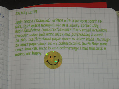
Jade Green (Diamine) written with a Kaweco Sport FP.  Nice, light green.  Reminds me of a sunny, spring day.  Good saturation.  Consisten, smooth lines.  Would definitely consider using this more often and purchasing a bottle.  On this Clairefontaine paper there is minor bleed-through.  On other paper, such as my Clairefontaine GraficFlow Hard cover Journal, there is no bleed-through.  I love this color.  It makes me happy.  =)


This last picture was written with a Kaweco Sport fountain pen with Diamine Jade Green ink.  We had gotten the Jade Green in a sample pack of a few different kinds of inks from Pear Tree Pen Company.  The sample packs are really a great (and cheap!) way to sample different brands and colors of inks.  It's so tough to get an accurate picture of the color of an ink on your monitor.  There's so many different variables as to the "true" color of an ink like how the picture was scanned in, your monitor color settings, things like that.  So it's definitely a great way to get just enough to try out on your own.  (This is where that glass pen comes in handy!  Just dip it into the sample, try it out on your Clairefontaine, and wash the color off to try the next color.  Works great!)


She used a Kaweco pen that was converted into an eye-dropper fountain pen.  For those that don't know this pretty cool technique, you basically eliminate the need for any kind of cartridge or converter.  You can fill up and use any ink in your pen relatively quickly without the hassle of a converter.  Writer's Bloc has a great write-up of how this is done here:

http://blog.shopwritersbloc.com/fountain_pens/pen_modification_convert_into_1.html

Most of your fountain pens can be converted into an eye-dropper pen, but, unfortunately, pens that have holes in the barrels, like my Lamy Al-star, can't be made into an eye-dropper pen.

Good Pens also has a great post about converting his Pilot Preppy FP into an eye-dropper:

http://goodpens.blogspot.com/2009/06/preppy-cartridge-fountain-pen-converted.html

And here's one from nrepose about using Noodler's Blue Ghost in a converted Preppy:

http://unpostednrepose.blogspot.com/2009/05/blue-ghost.html


Here's an example of the glass pen in use.  We received the ink sampler from Pear Tree Pens which included Noodler's Apache Sunset, Diamine Woodland Green, Diamine Maroon, and Diamine Quartz Black.  Sampling the inks with the glass pen took a matter of minutes.  Instead of worrying if your fountain pen is dry enough to put in your next ink, you can easily wash the color off the glass pen and use the next color.  


Fun with Calligraphy

I thought I'd post some pics of some pretty cool calligraphy.  The handwriting and calligraphy was done by my super-talented girlfriend, Melissa.  She used a Pilot Parallel Calligraphy Pen with a 1.5 mm nib.